Hi,
I have a Windows 10 (and older Windows OSs) laptop.
If I update to Windows 11, is there a way to have it look
like Windows 10?
Thanks in advance, John
Hi,
I have a Windows 10 (and older Windows OSs) laptop.
If I update to Windows 11, is there a way to have it look
like Windows 10?
Thanks in advance, John
On 8/17/24 01:07 PM, jaugustine@verizon.net wrote:
Hi,You can but should you?.... the new interface isn't that hard to get
I have a Windows 10 (and older Windows OSs) laptop.
If I update to Windows 11, is there a way to have it look
like Windows 10?
Thanks in advance, John
used to. And learning it would help you if you do any kind of web
searches for "how to's". Explanations are going to explain in the
default config, not your modified config.
Granted a lot can be done to minimize the transition shock. I didn't
like the right click content menu in explorer that hid a lot of the
options in a "more->" entry. So I did the registry edit to put it back
to Win 10 method.
Of course you see where I am coming from, I personally don't see why.
But then that's me. dbnnet did give you a possible option.
Hi,
I have a Windows 10 (and older Windows OSs) laptop.
If I update to Windows 11, is there a way to have it look
like Windows 10?
Granted a lot can be done to minimize the transition shock.
I didn't like the right click content
menu in explorer that hid a lot of the options in a "more->" entry.
So I did the registry edit to put it back to Win 10 method.
I don't know if this helps, but I'm using Classic Shell on
both and I don't recall any difference. However, CS is not
much like original Win10. I've been using Windows without
the candy since XP, so it works well for me: No skinned
window frames. No transparency. No round corners. And
my Start Menu has 4 items: Shut Down, Run, Settings,
Programs.
It's the way computing should be. Simple, Fast & Efficient!
I mostly use Linux (Mint), and for the same reason I
can't figure out why Cinamon is regarded as the "preffered"
interface.
It's overloaded like a donkey cart with features
(i.e. animated icons etc. that constatnly needs patching
and fixes) and not at all about simplicity and efficiency.
But at least with Linux one can determine and set up ones
system EXACTLY to their liking.
So I use the Xfce Interface and it offers breakthrough speed too.
Microsoft on the other hand has gone the route of
Apple in they THEY and not YOU will determine what the interface
should look like and is the very reason why so many people were very
unhappy when Win 11 was first released. That task Bar stuck
in the middle looked like a throwback to a 80's gaming console too!
Sometimes I really have to wonder if Microsoft ever even tries to
consult with customers to establish what THEY want too?
Linux Mint 22 (Wilma) Xfce 4.18.1 : Kernel 6.8.0-40 -generic
Microsoft on the other hand has gone the route of
Apple in they THEY and not YOU will determine what the interface
should look like and is the very reason why so many people were very
unhappy when Win 11 was first released. That task Bar stuck
in the middle looked like a throwback to a 80's gaming console too!
Sometimes I really have to wonder if Microsoft ever even tries to
consult with customers to establish what THEY want too?
You don't like cinnamon but I love it. I don't have animations,?pick from. Unlike mac and windows.
turned them off with a simple click. I've tried xfce, gnome,
mate, KDE over the course of 15 operating systems. I can get 1 or 2
working, but am never happy and gladly flip back to Mint.
I did like Zorin though.
But that's Linux, maybe a fault, but there are so many varieties to
If it were not for the fact that they are sooo many distros, I
really think that Linux would be like Android now and totally dominate
the market.
jaugustine@verizon.net wrote:
Hi,One can always tweak Win11 with third party software to make it 'look
I have a Windows 10 (and older Windows OSs) laptop.
If I update to Windows 11, is there a way to have it look
like Windows 10?
Thanks in advance, John
like Windows 10'.
Consider, first learning and using Win11 features before modification.
On 8/17/24 01:07 PM, jaugustine@verizon.net wrote:
Hi,You can but should you?.... the new interface isn't that hard to get
I have a Windows 10 (and older Windows OSs) laptop.
If I update to Windows 11, is there a way to have it look
like Windows 10?
Thanks in advance, John
used to. And learning it would help you if you do any kind of web
searches for "how to's". Explanations are going to explain in the
default config, not your modified config.
+1
My only exceptions in Windows 10 & 11 are that Bitlocker & Teams are
turned off.
However in Windows 8.1, Open Shell is the norm.
The problem is: every time they bring out a new version of Windows they change the layour of the start menu, the quick launch bar, the merged-by-default icons for running and capable-of-being-run apps etc.
I like to keep a common UI so I can switch between Win 10 on my laptop
and Win 7 on my desktop. The first thing I did with my WIn 10 was make
it look like Win 7 which in turn was made to look like XP and all
versions before it. Win 7 was when the rot began to set in, and Win 8
was when they started making every version different from the one before.
Newyana2 wrote:began to set in, and Win 8 was when they started making every version different from the one before.
On 8/19/2024 7:55 AM, NY wrote:
The problem is: every time they bring out a new version of Windows they change the layour of the start menu, the quick launch bar, the merged-by-default icons for running and capable-of-being-run apps etc.
I like to keep a common UI so I can switch between Win 10 on my laptop and Win 7 on my desktop. The first thing I did with my WIn 10 was make it look like Win 7 which in turn was made to look like XP and all versions before it. Win 7 was when the rot
adamant; she kept insisting it was a "designer" product. I love her dearly, so I bought it for her; me, who can see far beyond words.
I do the same thing. I especially can't stand having a Start Menu >> full of nonsense that takes up 1/6 of the screen. But this is also
motivated by customer expectations. People want to believe that each
version is a newer ,shinier, more magical version than the last. Most
people can only judge by appearances.
A lot of the changes now are also coming from cellphone and tablet
GUIs. They make no sense on a desktop, but they're what people think
of as new and shiny. That's what the Metro/WinRT calamity is all about.
I expect it's only going to get worse. I've noticed that when I check >> out any software lately it seems to all be bloated with *choice*. Menus
that go on forever, options to have all sorts of panel layouts in the
window, choice of background and text color, etc. For the most part
it's not useful choice. Just choice for the sake of it.
I can't help but chuckle at the issue raised here. It strikes me that Win11 is nothing more than Win10 with a mask; and yet people have to install additional mask-removing software.
I was recently shopping with my niece. I'd told her I'd buy her a big present of her choosing. She chose a shopping basket, wicker with large handles, but dipped in liquid plastic. It cost £145. I tried and tried to talk her out of it, but she was
Ed
On Mon, 8/19/2024 1:53 PM, Ed Cryer wrote:rot began to set in, and Win 8 was when they started making every version different from the one before.
Newyana2 wrote:
On 8/19/2024 7:55 AM, NY wrote:
The problem is: every time they bring out a new version of Windows they change the layour of the start menu, the quick launch bar, the merged-by-default icons for running and capable-of-being-run apps etc.
I like to keep a common UI so I can switch between Win 10 on my laptop and Win 7 on my desktop. The first thing I did with my WIn 10 was make it look like Win 7 which in turn was made to look like XP and all versions before it. Win 7 was when the
adamant; she kept insisting it was a "designer" product. I love her dearly, so I bought it for her; me, who can see far beyond words.
I do the same thing. I especially can't stand having a Start Menu >>> full of nonsense that takes up 1/6 of the screen. But this is also
motivated by customer expectations. People want to believe that each
version is a newer ,shinier, more magical version than the last. Most
people can only judge by appearances.
A lot of the changes now are also coming from cellphone and tablet >>> GUIs. They make no sense on a desktop, but they're what people think
of as new and shiny. That's what the Metro/WinRT calamity is all about.
I expect it's only going to get worse. I've noticed that when I check
out any software lately it seems to all be bloated with *choice*. Menus
that go on forever, options to have all sorts of panel layouts in the
window, choice of background and text color, etc. For the most part
it's not useful choice. Just choice for the sake of it.
I can't help but chuckle at the issue raised here. It strikes me that Win11 is nothing more than Win10 with a mask; and yet people have to install additional mask-removing software.
I was recently shopping with my niece. I'd told her I'd buy her a big present of her choosing. She chose a shopping basket, wicker with large handles, but dipped in liquid plastic. It cost £145. I tried and tried to talk her out of it, but she was
Ed
It might not even be real wicker. it's the year 2024 after all :-)
*******
It's quite possible the average user wants "shiny" interfaces.
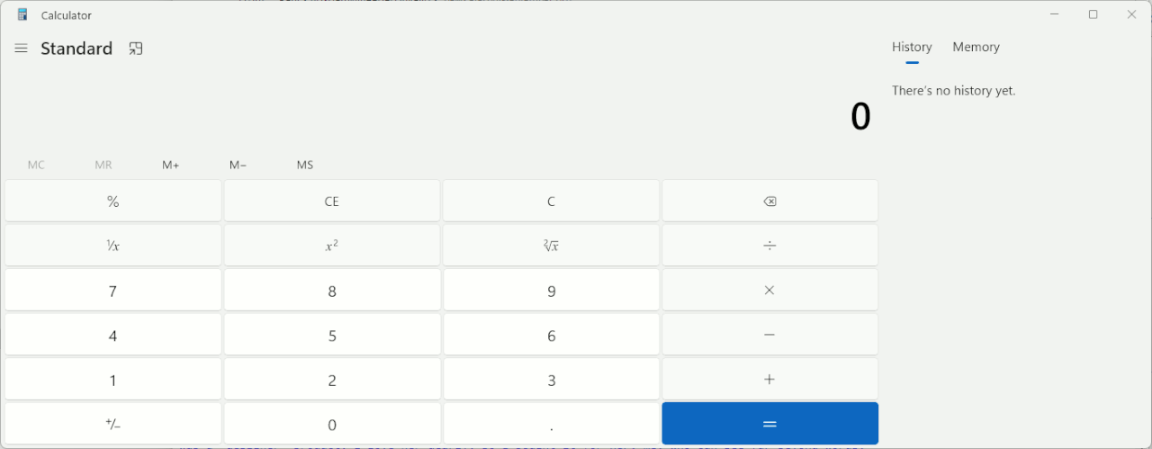
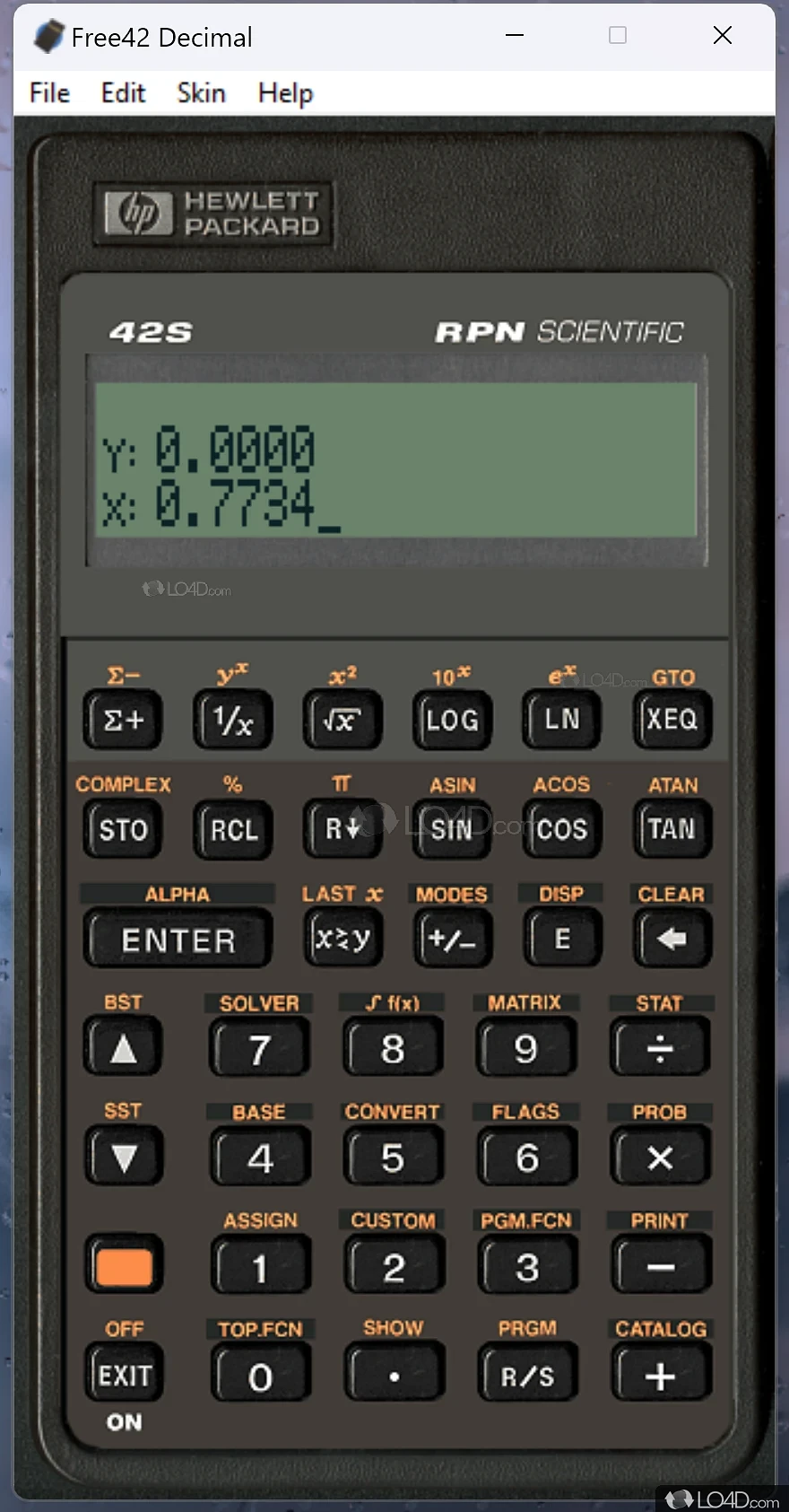
But how can you defend designs like this ?
A real calculator looks like this. I do my taxes with this.
There is colour and contrast.
https://m.media-amazon.com/images/I/51FZVGMQQ8L._AC_.jpg
And this is Win11 calc. If you zoom in, you can see how the
characters are feathered. They're not ClearType. It's grayscale mush.
[Picture]
https://i.postimg.cc/qRH3k90S/calc-large-quantities-white-space.gif
If they'd wanted to, they could have made a calculator out of pixmaps
of keys, and made it look like a "real" calculator.
One of my pet peeves, is when the characters do not use the
entire dynamic range of the screen. I want to see characters where:
1) The glyphs are thick enough to "see".
2) If the screen is code 0xFF, the character is made from 0x00 pixels.
Not 0x10 pixels or 0x20 pixels (making me squint).
Even some young people have poor eyesight, and they should not
have to squint to make out an interface.
Paul
On 8/19/24 06:25 PM, Paul wrote:rot began to set in, and Win 8 was when they started making every version different from the one before.
On Mon, 8/19/2024 1:53 PM, Ed Cryer wrote:
Newyana2 wrote:
On 8/19/2024 7:55 AM, NY wrote:
The problem is: every time they bring out a new version of Windows they change the layour of the start menu, the quick launch bar, the merged-by-default icons for running and capable-of-being-run apps etc.
I like to keep a common UI so I can switch between Win 10 on my laptop and Win 7 on my desktop. The first thing I did with my WIn 10 was make it look like Win 7 which in turn was made to look like XP and all versions before it. Win 7 was when the
adamant; she kept insisting it was a "designer" product. I love her dearly, so I bought it for her; me, who can see far beyond words.
I do the same thing. I especially can't stand having a Start Menu
full of nonsense that takes up 1/6 of the screen. But this is also
motivated by customer expectations. People want to believe that each
version is a newer ,shinier, more magical version than the last. Most
people can only judge by appearances.
A lot of the changes now are also coming from cellphone and tablet
GUIs. They make no sense on a desktop, but they're what people think
of as new and shiny. That's what the Metro/WinRT calamity is all about. >>>>
I expect it's only going to get worse. I've noticed that when I check
out any software lately it seems to all be bloated with *choice*. Menus >>>> that go on forever, options to have all sorts of panel layouts in the
window, choice of background and text color, etc. For the most part
it's not useful choice. Just choice for the sake of it.
I can't help but chuckle at the issue raised here. It strikes me that Win11 is nothing more than Win10 with a mask; and yet people have to install additional mask-removing software.
I was recently shopping with my niece. I'd told her I'd buy her a big present of her choosing. She chose a shopping basket, wicker with large handles, but dipped in liquid plastic. It cost £145. I tried and tried to talk her out of it, but she was
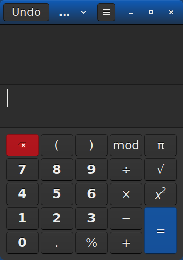
I could work on this for color choice but it's compact and very readable too. https://i.postimg.cc/6Qgcw3qb/Calc-in-Linux.png
Ed
It might not even be real wicker. it's the year 2024 after all :-)
*******
It's quite possible the average user wants "shiny" interfaces.
But how can you defend designs like this ?
A real calculator looks like this. I do my taxes with this.
There is colour and contrast.
https://m.media-amazon.com/images/I/51FZVGMQQ8L._AC_.jpg
And this is Win11 calc. If you zoom in, you can see how the
characters are feathered. They're not ClearType. It's grayscale mush.
[Picture]
https://i.postimg.cc/qRH3k90S/calc-large-quantities-white-space.gif >>
If they'd wanted to, they could have made a calculator out of pixmaps
of keys, and made it look like a "real" calculator.
One of my pet peeves, is when the characters do not use the
entire dynamic range of the screen. I want to see characters where:
1) The glyphs are thick enough to "see".
2) If the screen is code 0xFF, the character is made from 0x00 pixels.
Not 0x10 pixels or 0x20 pixels (making me squint).
Even some young people have poor eyesight, and they should not
have to squint to make out an interface.
Paul
It's quite possible the average user wants "shiny" interfaces.
But how can you defend designs like this ?
A real calculator looks like this. I do my taxes with this.
There is colour and contrast.
https://m.media-amazon.com/images/I/51FZVGMQQ8L._AC_.jpg
And this is Win11 calc. If you zoom in, you can see how the characters
are feathered. They're not ClearType. It's grayscale mush.
[Picture]
https://i.postimg.cc/qRH3k90S/calc-large-quantities-white-space.gif
If they'd wanted to, they could have made a calculator out of pixmaps of keys, and made it look like a "real" calculator.
One of my pet peeves, is when the characters do not use the entire
dynamic range of the screen. I want to see characters where:
1) The glyphs are thick enough to "see".
2) If the screen is code 0xFF, the character is made from 0x00 pixels.
Not 0x10 pixels or 0x20 pixels (making me squint).
Even some young people have poor eyesight, and they should not have to
squint to make out an interface.
Paul
I could work on this for color choice but it's compact and very readable
too.
https://i.postimg.cc/6Qgcw3qb/Calc-in-Linux.png
| Sysop: | Keyop |
|---|---|
| Location: | Huddersfield, West Yorkshire, UK |
| Users: | 361 |
| Nodes: | 16 (2 / 14) |
| Uptime: | 123:31:00 |
| Calls: | 7,716 |
| Files: | 12,861 |
| Messages: | 5,727,956 |